(Originally published 6/11/2016)
I’m right in the thick of working out cover looks for the first three books I plan to publish through Wheeler Street Press and through this process I realize that I never gave much thought to book design, especially when it comes to covers. I’ve always picked a book up in a library or a bookstore for various reasons: I liked the writer’s work and wanted to read more; someone suggested the book/I read a favorable review; I was drawn to pick up the book and peek inside, based on some unconscious reasoning and/or the cover art was appealing or spoke to me in some way.
Now that I am actually doing my own research on the kinds of cover art I am drawn to or find aesthetically pleasing, I am struck by how opinionated I am about cover design (the images, the fonts, the way all the elements mesh together as a representation of the author’s work inside) and how quickly I make the decision about whether I like the exterior of the book, am impartial to it, or outright hate it. Before, I honestly never thought that much about it … and now I simply obsess about the subject.
I’d like to share a few of the covers that, while being nothing like the design ideas I have for my own books, I find to be particularly striking and successful. It’s ultimately a subjective choice, and since I have not read any of the content nestled within the books themselves, I truly have judged them solely by their cover. So, I’ve rejected the adage and followed my own truth… at least when it comes to covers of novels.
Four very different covers, but all from one imprint, Ecco Press. Each one has a certain power to it, with a sense that a lot of thought, effort and care went into every detail. This is definitely not the case with the majority of covers I’ve been studying lately.
I have absolutely no idea what this book is about, but the imagery is terrifying to me – the flying hair covering every bit of the woman’s face, the awkward positioning of her body, as if she had been flung to the ground or had thrown herself down, and that blood-red title. Chilling, effective and unforgettable.
Another woman, another title in red, but this cover is enthralling for very different reasons: the starkness of the black background; the shiny hair (like a record album spinning); the bright blue eyeshadow (which closely matches both the shine in her hair and the blue material draped below her hand); the painted fingernails and lips; and the ethereal quality of both the woman and her pose.
I’m usually not a fan of cartoon artwork on novels – for some reason I’m biased against them and feel they belong solely on children and YA books. But the detail, the vibrancy of the colors and shading, the snowflakes, the cityscape, the marquee-like Broadway lights in the title, the poses of the 3 faceless people (and the dog full of expression) – it all coalesces into a fun, sophisticated invitation to buy this book.
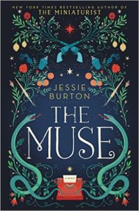
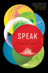
And lastly, four more covers that are stylistically very, very divergent from one another, yet they are all attractive to my newly cover-obsessed eye.
I only hope that the choices I ultimately land on for my first few covers will illicit the same kind of positive reactions from possible readers as these book covers have created in me.


